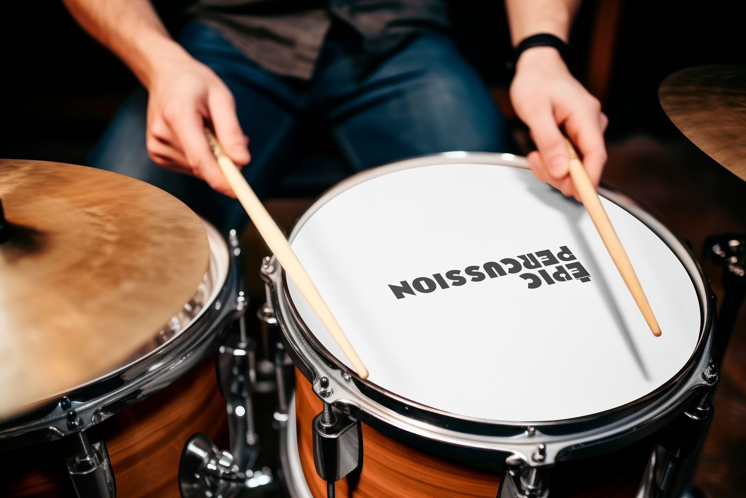
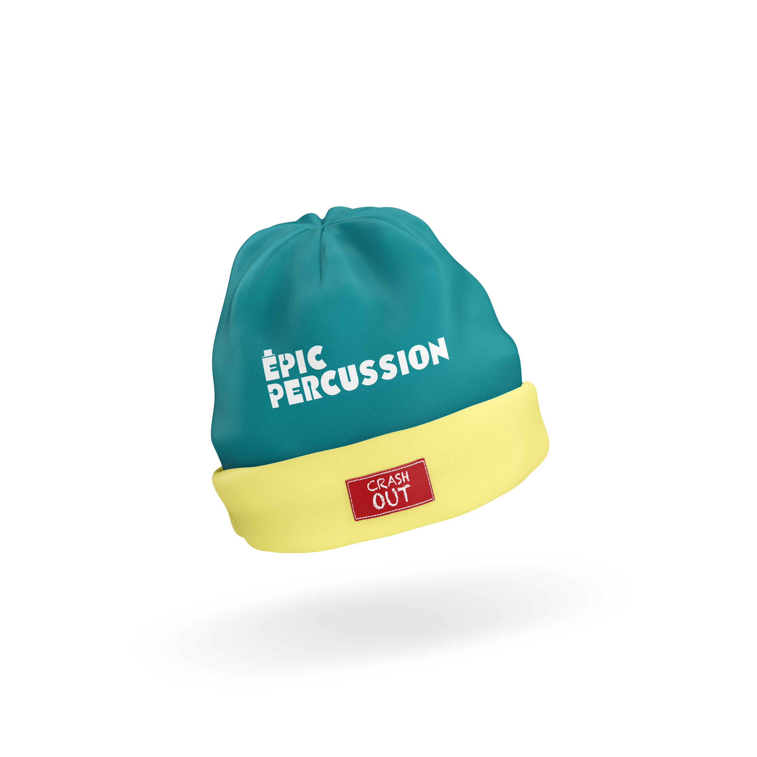
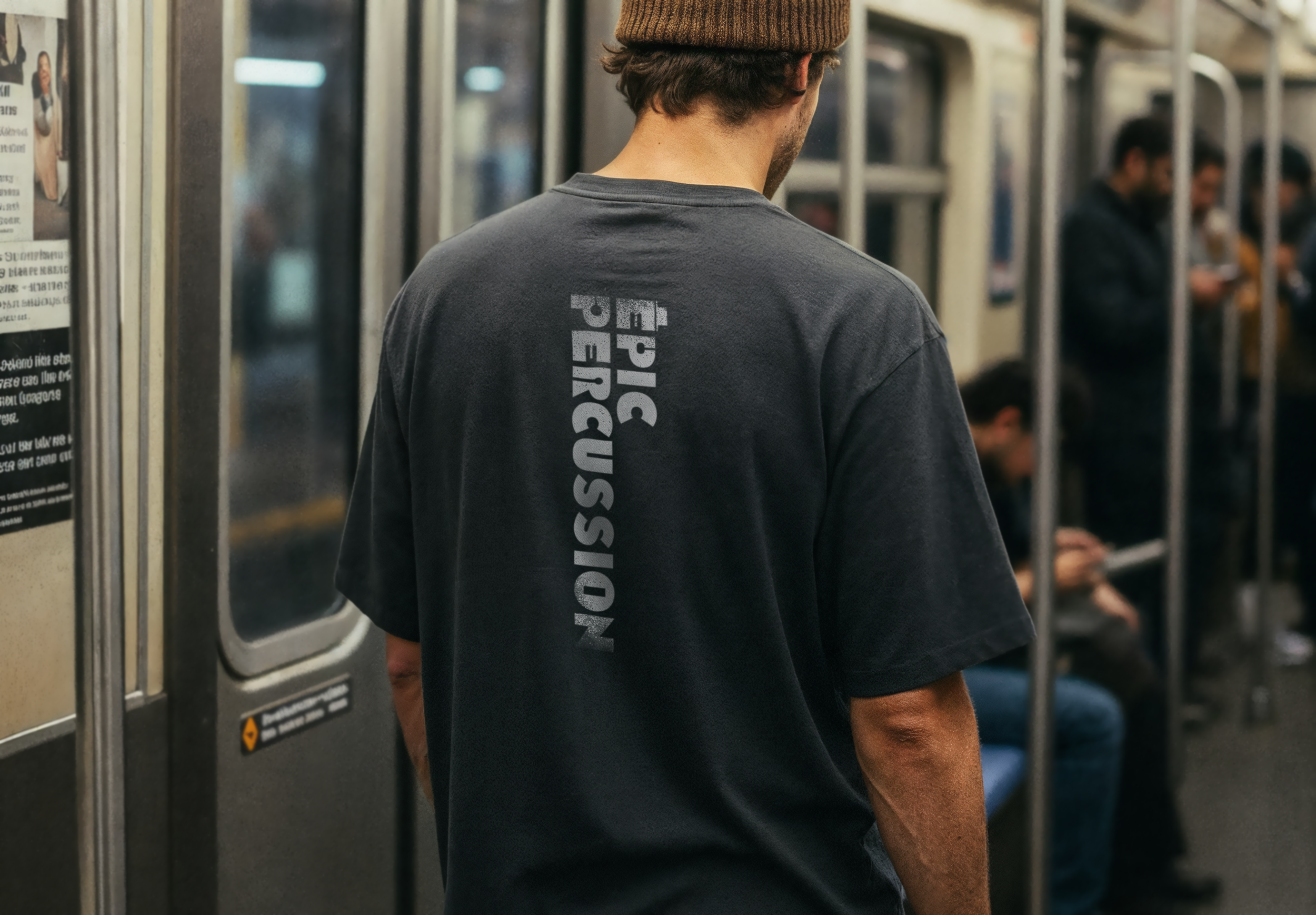
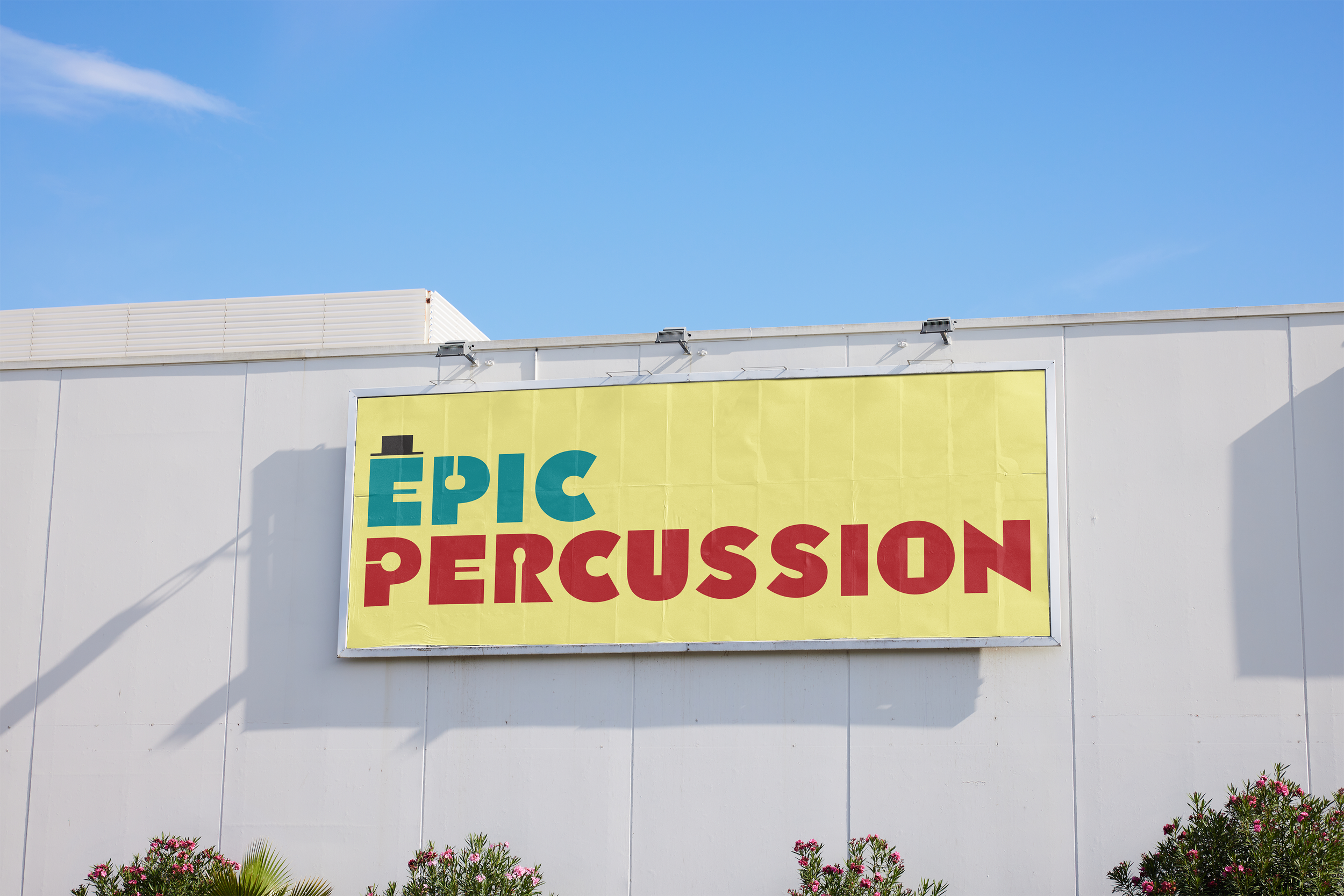
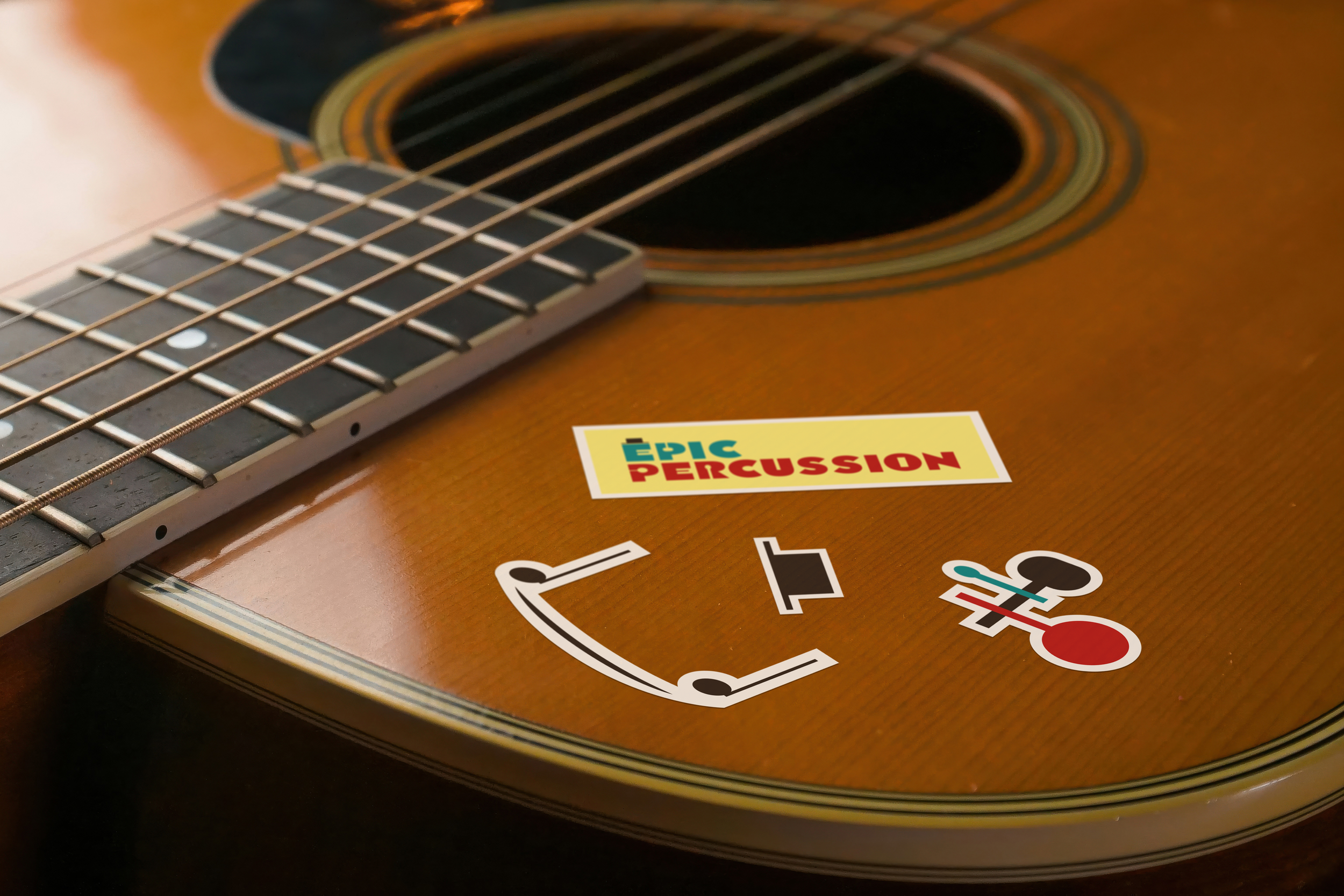
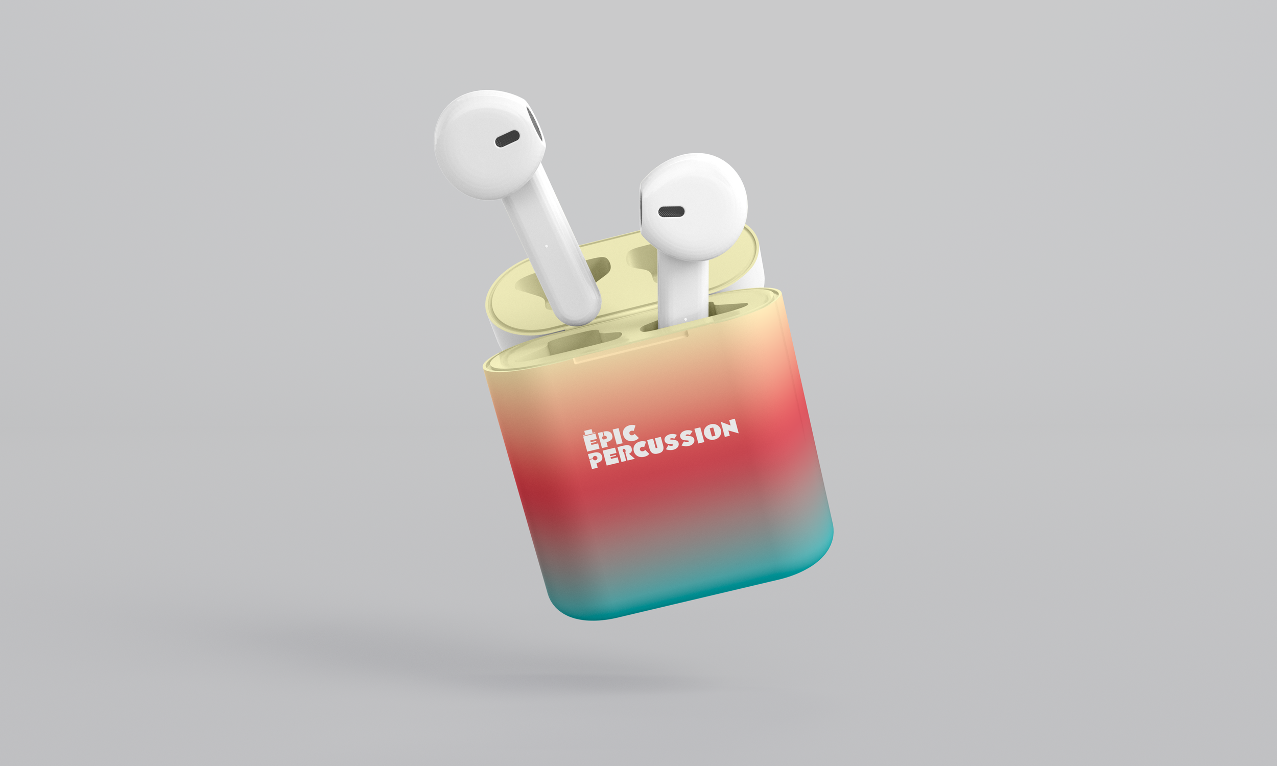
Epic Percussion is a music store brand built around expressive typography and rhythm-driven visual details. The logo uses bold letterforms in blue and red, with musical notation integrated directly into the type that appears within the negative space of the “O” form, as a stylized top-hat shape on the “E,” and as negative-space elements that resemble different types of drumstick mallets. These typographic details reinforce the brand’s connection to percussion and movement while maintaining clarity and legibility. Set against a light yellow background, the identity feels warm, energetic, and approachable, inviting musicians of all ages into the space.