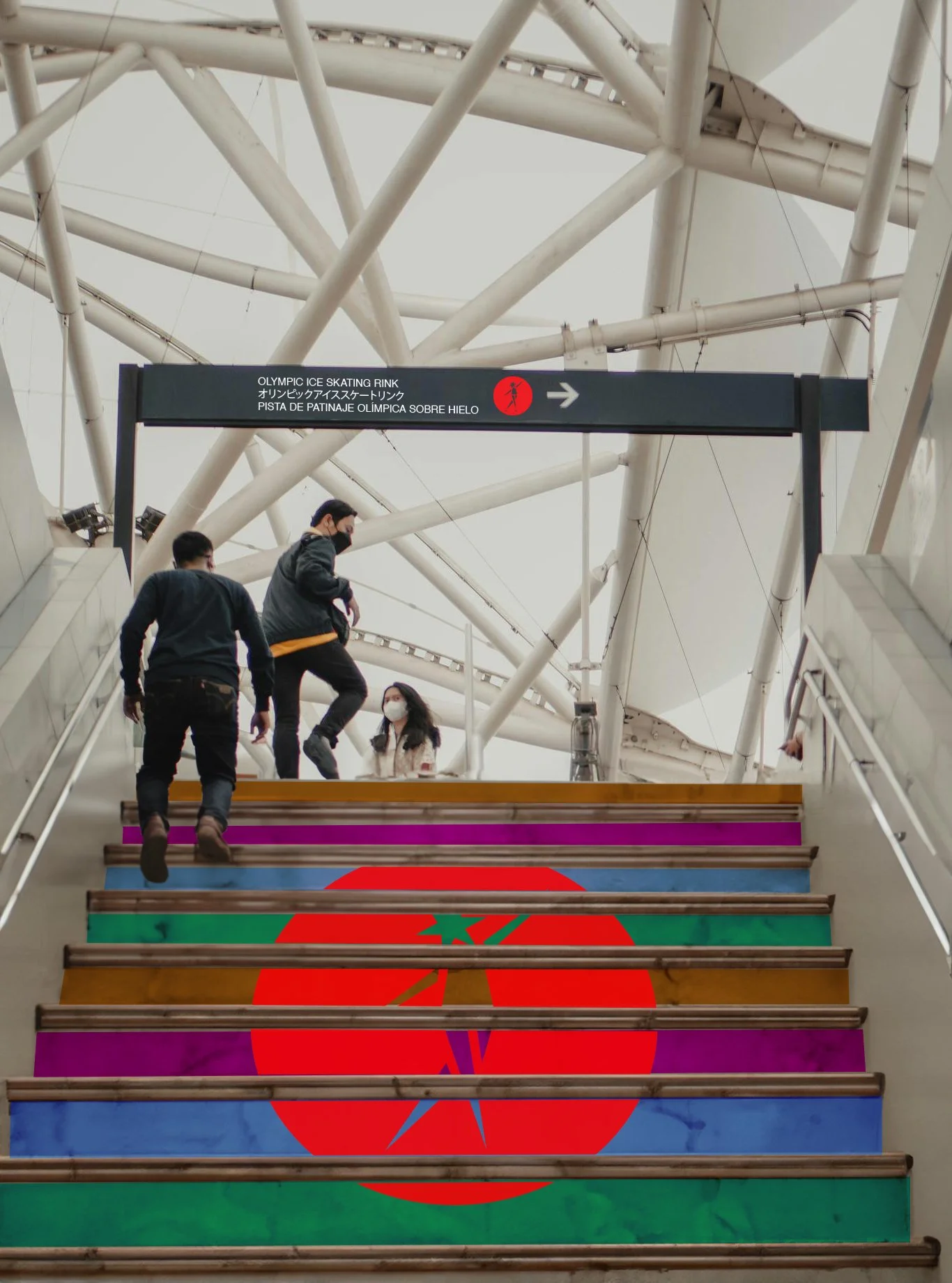
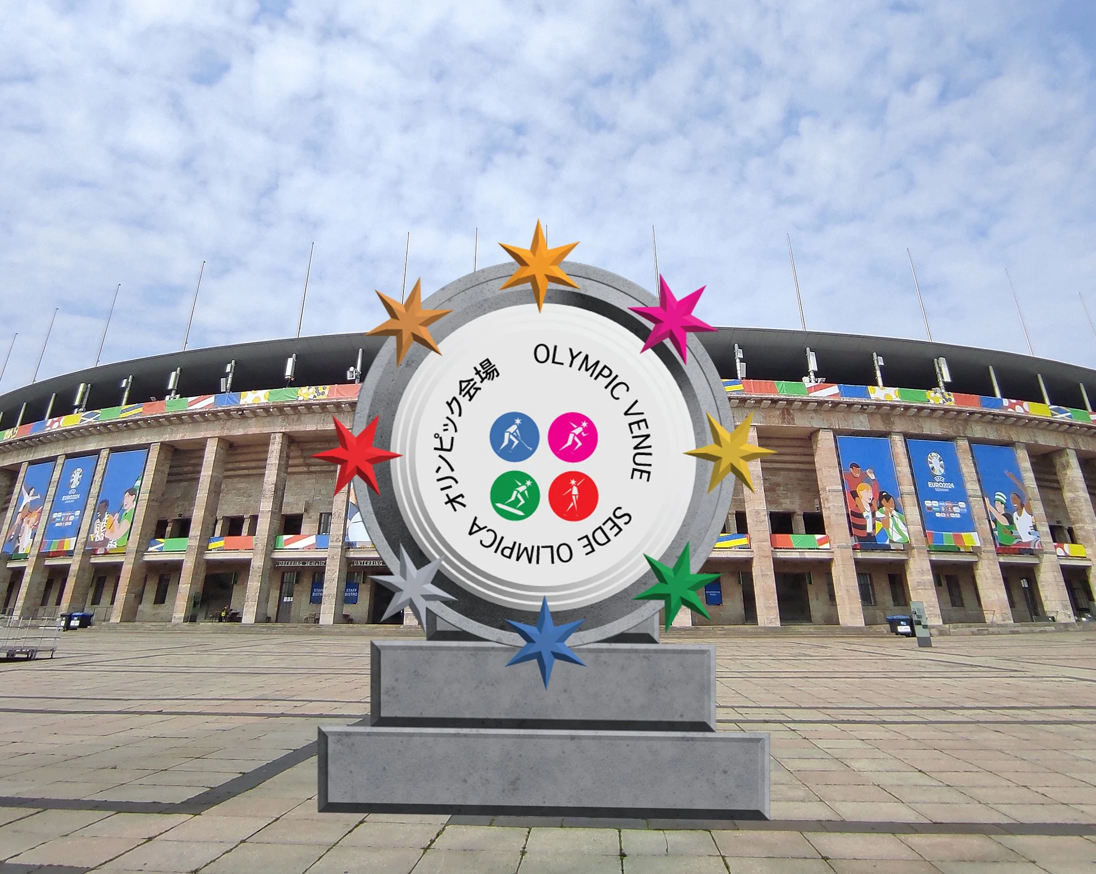
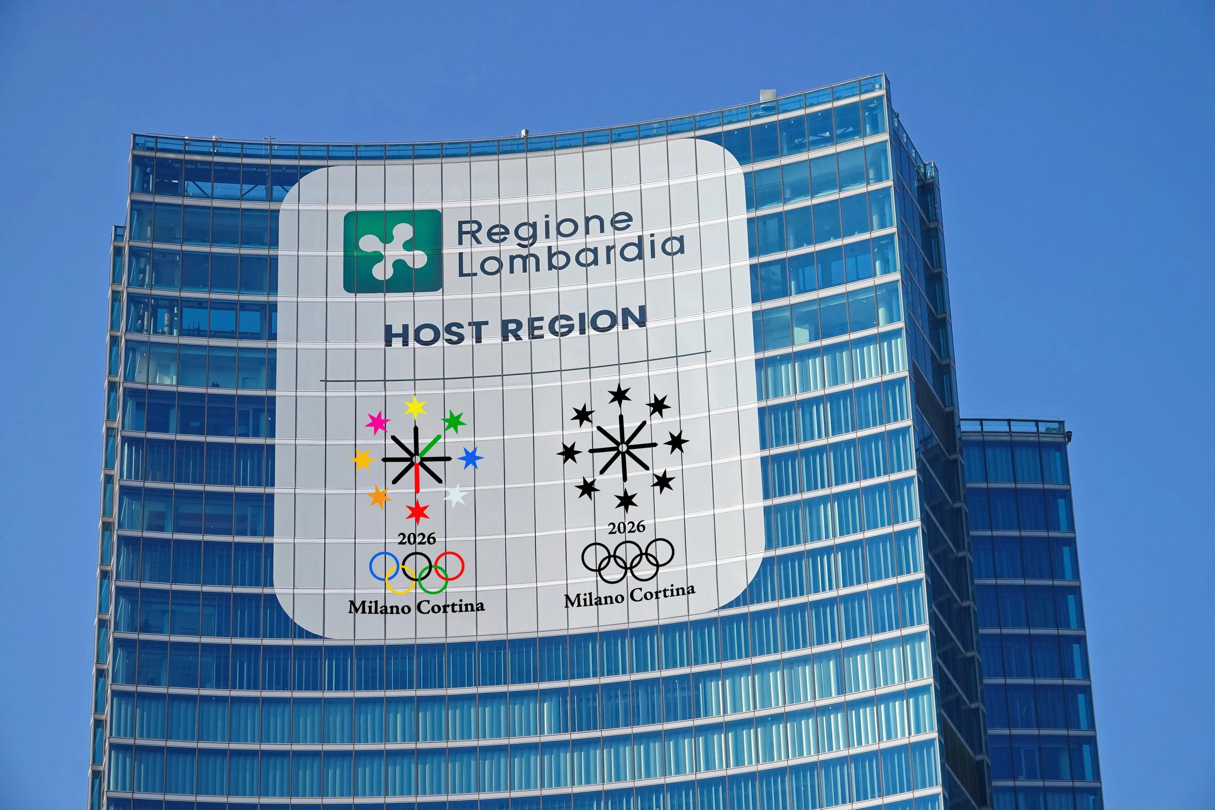
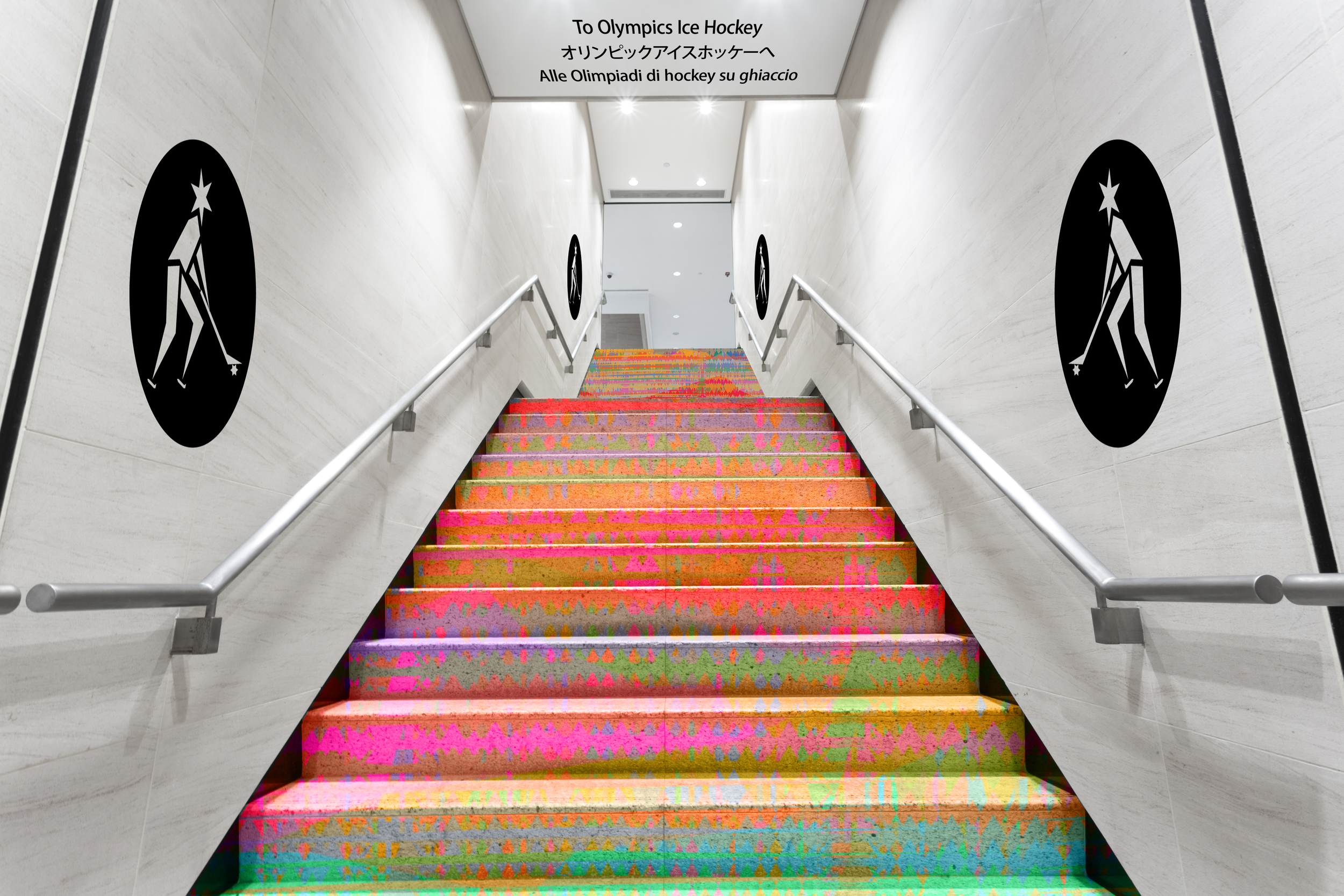
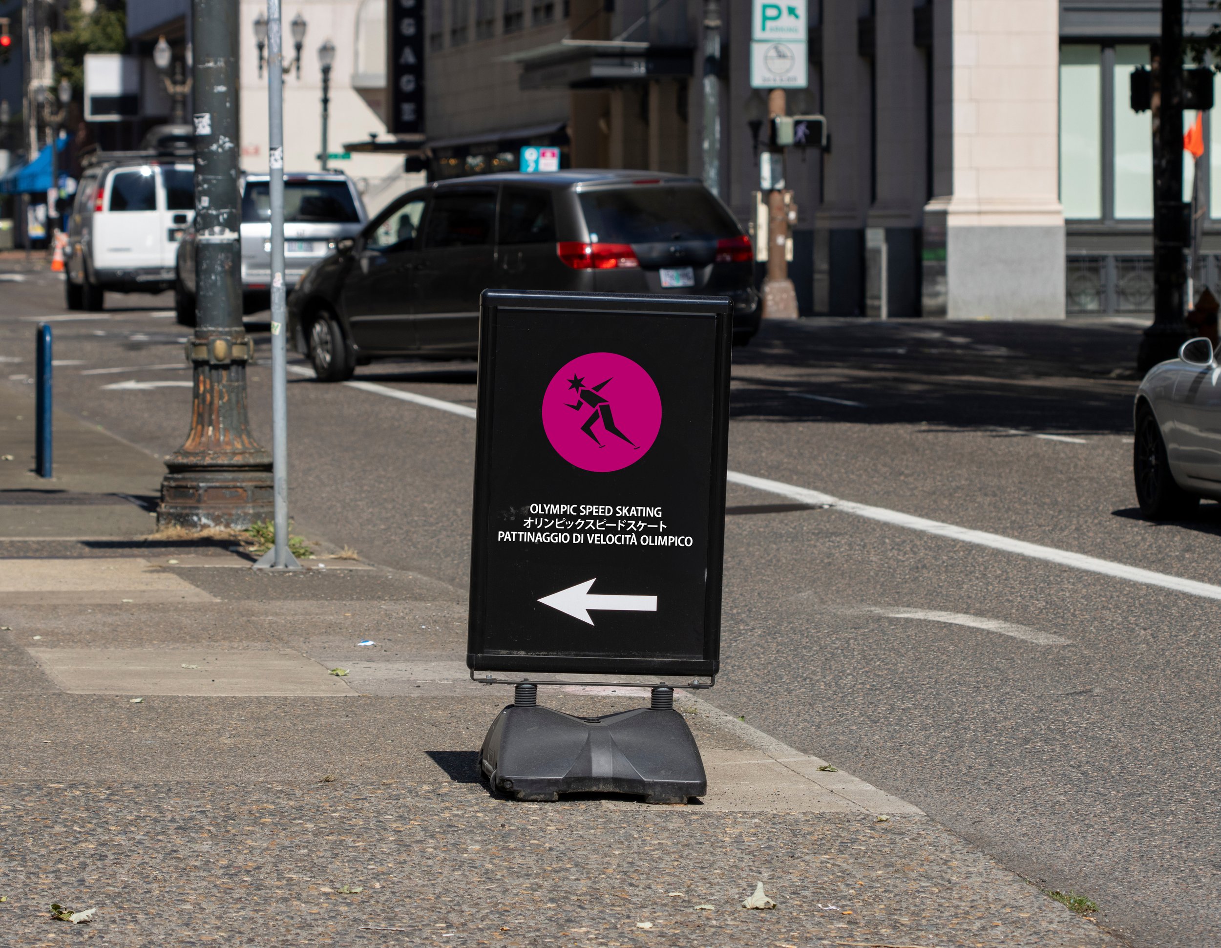
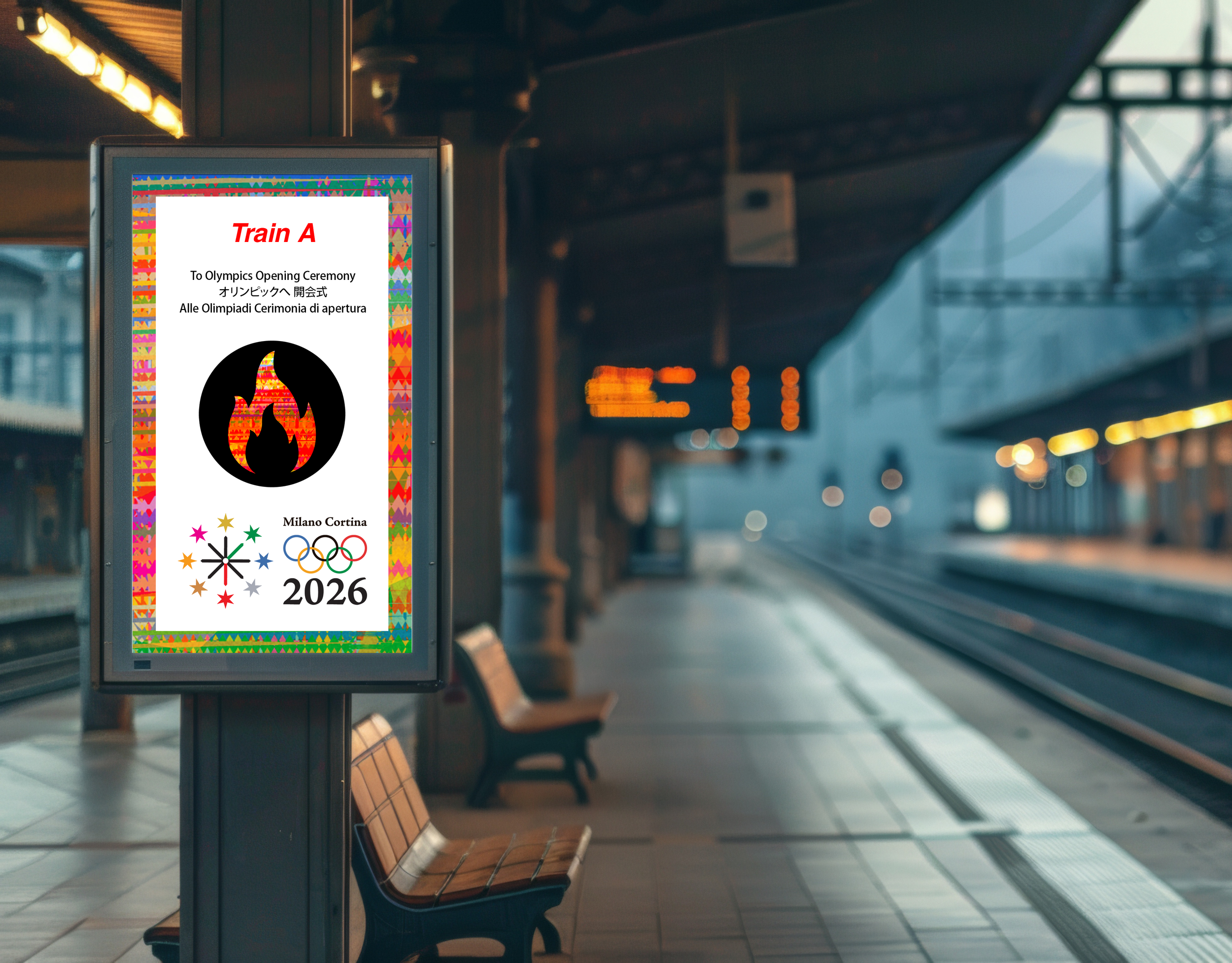
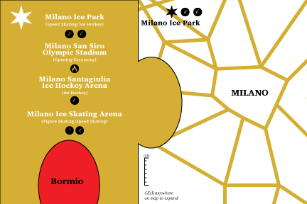
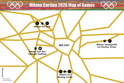
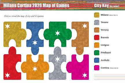
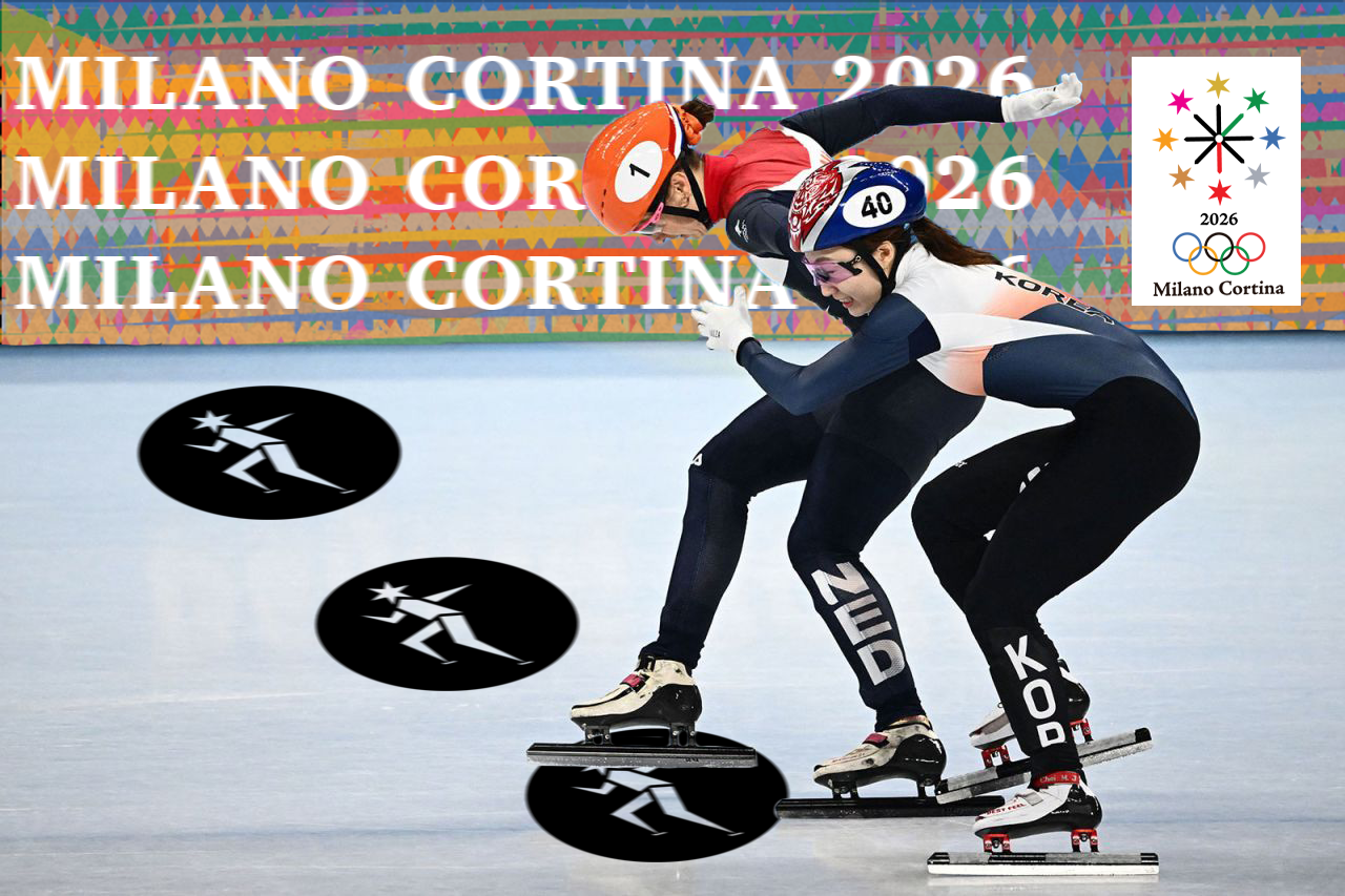
This branding concept for the Milano Cortina 2026 Winter Olympic Games is rooted in symbolism, place, and time. The core mark features eight six-pointed stars representing each host city, referencing snowflake geometry and the winter season, while the overall composition forms a clock with green and red arrow hands pointing to “26” to mark the year 2026. This idea was inspired by Milan’s golden Madonna statue and Cortina d’Ampezzo’s historic clock tower. A triadic color system based on Olympic medals establishes hierarchy, with gold at the top for victory: Milan in gold as the host city and fashion capital, Tesero in silver, and Verona in bronze. Additional colors reflect each city’s identity and environment; Bormio in red for alpine intensity, Livigno in orange for warmth and elevation, Predazzo in green for surrounding forests, Rasen-Antholz in blue for its lakes and winter sport heritage, and Cortina in pink inspired by the gem-like hues of the Dolomite mountains. The system expands into a wayfinding map and a woven blanket–inspired pattern that unites all city colors, creating warmth, contrast, and energy against snowy Olympic landscapes while reinforcing themes of community, approachability, and shared celebration across banners, pictograms, and environmental graphics.


Previous
Previous
Donut Revolution
Next
Next